catalysis matplotlib python visualization 22 May 2017
Visualizing reactor simulation results
Exploring the versatile matplotlib package.
Recently I was involved in a project where I was simulating a chemical reaction network leading to the deactivation of a solid catalyst in a tubular reactor. As a result of those simulations I obtained concentrations of several species involved in the reactions that were defined for a specific point in space (reactor coordinate) and time - usually referred to as time on stream (TOS). Naturally this kind of data fit very well to be stored in a matrix form, and since I wanted to see the data to understand it a bit better I started exploring options for visualizing matrix datasets using one of the most powerful python plotting libraries, namely matplotlib.
The data
Going into a detailed description of the particular model used to produce the data deserves a separate post and therefore I'll just mention a few important points here and probably write a full length post about it some time in the future.
First of all the model used in the simulation was designed to closely approximate the actual catalysts deactivation processes that are also studied experimentally.
In the simulations the tubular reactor is approximated by the plug flow reactor model to which a mixture of reactant gases are fed at specified flow conditions.
In order to solve the model equations the reactor was divided into 200 separate segments and the reactions were evolved for 438 discrete time steps therefore the resulting concentrations profiles are given as arrays of the shape 438 x 200. This means that for a given specie each row of the array holds it's concentration profile along the reactor at a specific time. Analogously each column of the array stores the evolution of the concentration in a discrete reactor segment.
Heatmap
A heat map is probably the most obvious way of graphically representing a 3D dataset on a flat 2D plot. Each value of the matrix is mapped into (or encoded with) a color patch placed at the coordinates specified by the row and column. The color is usually determined from a specially designed palette called a colormap. There are many colormaps available in matplotlib and choosing the right depends on a particular application and probably your sense of aesthetics. I highly recommend reading this blog post to learn more about avoiding common bad choices.
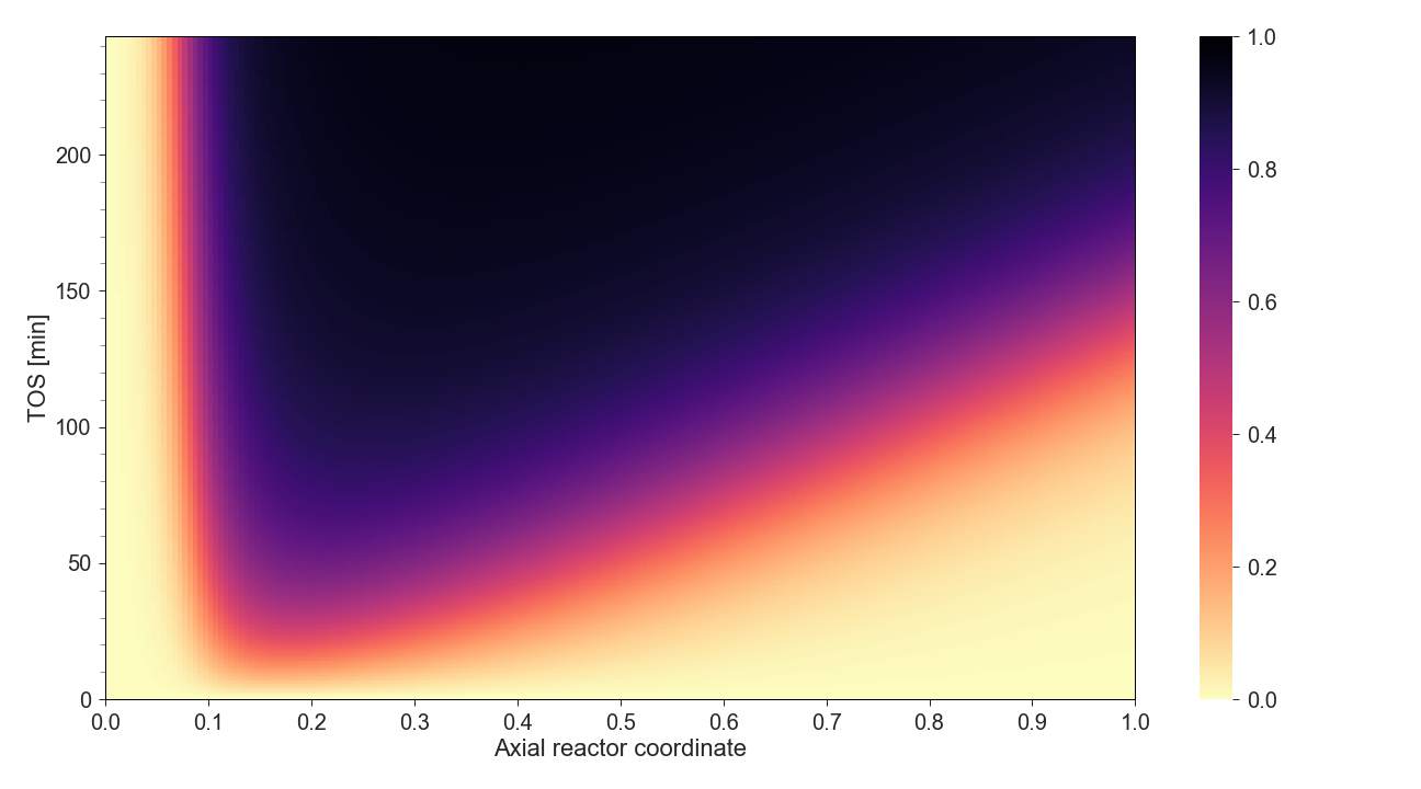
This particular heatmap was generated with seaborn package that provides a lot of convenient, high-level methods for visualizing data with matplotlib. The plot can be generated by a single line (line 9 in the code below) however to have meaningful axis labels and tick values I tweaked some of the respective settings.
3D Plot
Since the data we have is 3-dimensional in a sense that we can assign an x, y and z axes it seems only natural to try and plot it in 3D (more accurately a 2D projection of a 3D plot). Since we can safely assume that the physical quantity being modeled on a discrete grid is in principle continuous therefore the most suitable choice seems to be 3D surface plot.
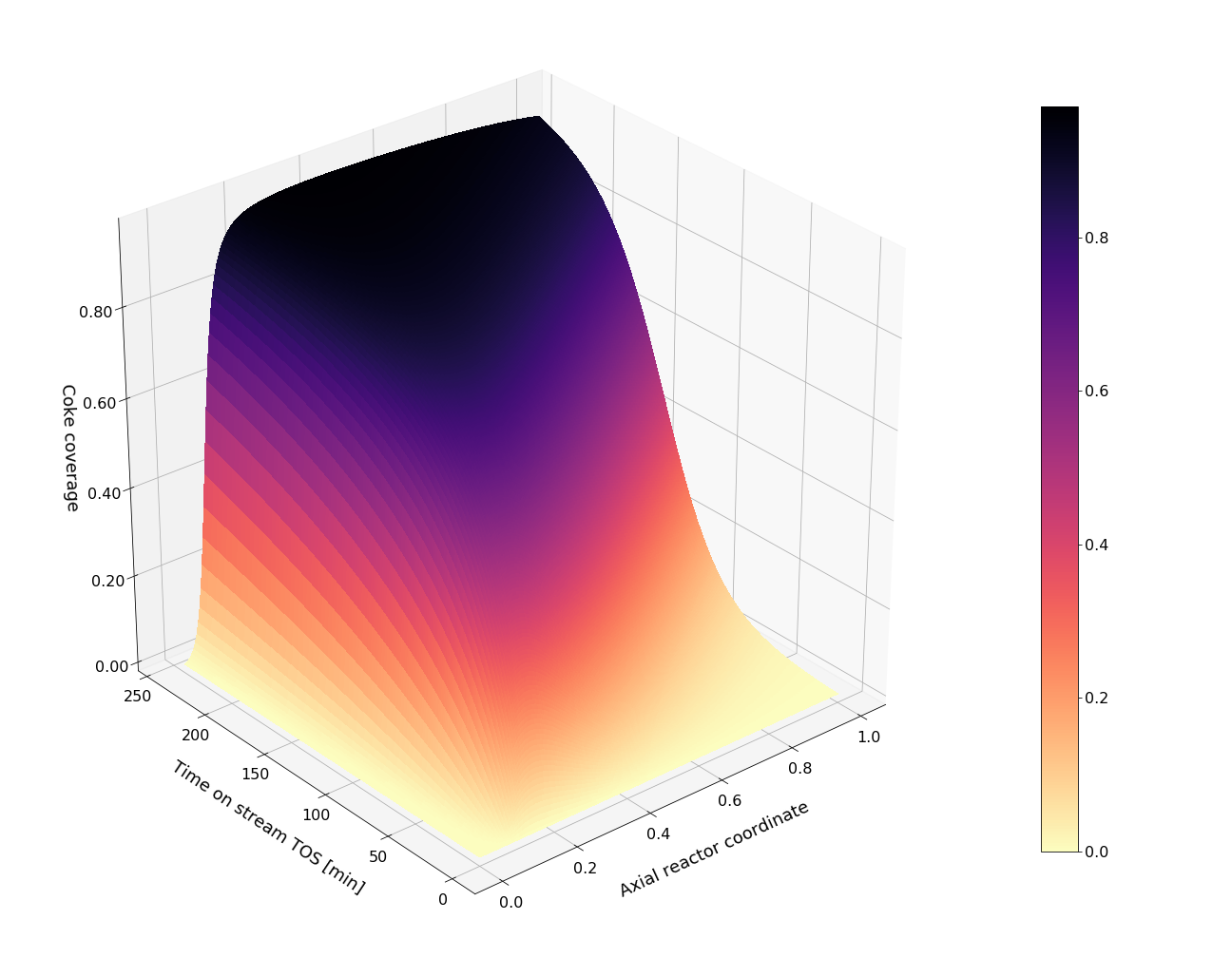
Creating a surface plot requires a bit more data manipulation since the
plot_surface method expects coordinate matrices and not coordinate
vectors. Fortunately numpy provides a convenient
meshgrid
method to do the work for us. As in the previous case rest of the code is mostly updating some
of the display settings of the axes and labels.
Animation
matplotlib also allows making animations and saving them as gifs or one of the video formats. Here I'll animate the deactivation data showing one row of the data matrix at a time, one after another. The plot area below can be thought of as the tubular reactor with the inlet on the left hand side and the outlet on the right hand side. With the flow of gas reactant mixture and passage of time the catalyst will deactivate, which in this particular case can be observed as the gradual change in color from yellowish to black.
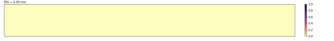
For comparison I also made the same animation but using the Greys colormap
since it is more realistic compared to the actual deactivation. This is because
the fresh catalyst is a white powder and when it gets deactivated it turns
black.
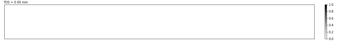
The particular method used in this example is FuncAnimation that requires
two additional functions to be defined, one that will be responsible for
updating the plot values (in our case called update) and an initialization
function that sets the values for the first frame of the animation
(init_coke). The plotting is done through the pcolormesh function that
creates a pseudocolor plot of a 2D array and can be thought of as a low-level
function for creating heatmaps.
Summary
Out of the three visualization methods above I think the most intuitive one is the animation since it quickly conveys the message and it's mostly self explanatory. This makes it a preferable choice for slide presentations, web pages and other digital formats, however it would be a poor choice for any printable media.
When it comes to creating graphics for articles, books and anything else that is expected to be printable I would recommend the heat map over the 3D surface plot since I find it easier to see the overall trend of the data changes and also to read the value for a specific coordinate pair. The surface plot looks much cooler but it might harder to read the (x, y, z) values having only one projection. Moreover deciding which projection to choose or in other words how to position the axes with respect to the viewer is another issue that has to be decided based on some trials and the features of the dataset.